Introduction
In the world of design, identity graphics serve as the visual representation of brands, making a lasting impression on audiences while communicating core values and messaging. Whether you’re an intermediate designer looking to elevate your skills or an expert seeking to refine your craft, these ten tips for branding, stationery, and logo design will guide you toward creating impactful identity graphics.
Branding is an essential aspect of any business or organization. For intermediate and expert designers, the challenge is to elevate these components to achieve a cohesive identity that resonates with the intended audience. Here are ten tips for optimizing your identity graphics, illustrated with examples to enhance your understanding.
1. Understand the Brand Essence
Before creating any identity asset, immerse yourself in a comprehensive understanding of the brand’s mission, values, and target audience.
Example: Consider Airbnb’s brand essence – belonging and adventure. Their identity graphics emphasize warmth and inclusivity, including friendly fonts and earthy color palettes that resonate with travelers.
2. Choose a Color Palette Wisely
Colors evoke emotions and associations. Select a color palette that reflects the brand’s personality and message while ensuring it’s versatile across various platforms.
Example: Coca-Cola uses red to convey excitement and energy, while Starbucks employs greens to suggest sustainability and a connection to nature.
3. Prioritize Typography
Typography plays a crucial role in visual identity. Choose fonts that enhance readability and align with the brand’s character while designing a hierarchy that guides the viewer’s eye.
Example: The minimalist and clean typography of Apple’s branding reflects modernity and simplicity, making their products instantly recognizable.
4. Design with Versatility in Mind
Your designs should look great in various formats, from business cards to social media profiles. Always create adaptable designs that maintain consistency and integrity across multiple mediums.
Example: The Nike swoosh logo is effective in both large billboards and small labels, showcasing versatility that enhances brand recognition.
5. Keep It Simple
Simplicity breeds recognition. Aim for designs that are impactful yet straightforward, avoiding overcrowding or overly complex graphics.
Example: Google’s logo is simple yet iconic, often adapting to various themes with minimal alterations. Its clarity ensures it remains recognizable globally.
6. Create a Unique Logo
A distinctive logo sets the brand apart. Ensure that your logo is memorable, reproducible, and representative of the brand’s ethos.
Example: The FedEx logo cleverly uses negative space to create an arrow between the “E” and “x,” adding an element of innovation that aligns with their commitment to speed.
7. Consider the Audience’s Perspective
Design with empathy. Understand your target audience’s preferences and cultural contexts, integrating their perspectives into your designs to foster connection and relatability.
Example: The colorful and playful design of Ben & Jerry’s branding resonates with a younger audience, emphasizing fun, engagement, and social consciousness.
8. Invest in High-Quality Photography
If your identity graphic includes photography, ensure that it reflects the brand’s quality and ethos. High-quality visuals enhance professionalism and credibility.
Example: National Geographic is known for its breathtaking photography, which elevates its brand identity and reinforces its commitment to nature and storytelling.
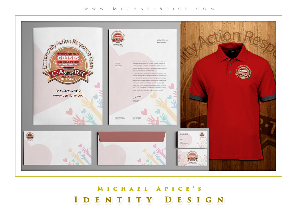
9. Create Cohesive Stationery
Your stationery should reflect the identity established through logos and color schemes and should be designed to reinforce cohesiveness across all touchpoints.
Example: The stationery of The New York Times features a clean layout and uses consistent typography, creating a trustworthy and professional appearance.
10. Seek Feedback and Refine
Always value constructive criticism. Collect feedback from peers and target audiences, using it to refine your designs to ensure they resonate effectively.
Example: Dropbox often engages its community for feedback on new features and designs, iterating its branding based on user insights to enhance user experience and identity alignment.
“A brand is not just a logo; it’s the experience of a collective story, and the designer’s role is to bring that story to life through thoughtful visual communication.”
Conclusion
In conclusion, crafting effective identity graphics requires a blend of creativity, strategy, and empathy. By focusing on these ten tips, intermediate designers and experts alike can enhance their branding skills and significantly impact the visual landscape.
Always remember, “Design is the silent ambassador of your brand.” – Michael Apice.
Embrace this wisdom, and let it guide your design journey as you create identities that not only stand out but also resonate with audiences.


